
Meaghan Hendricks has done it again. In this amazingly fun and effective tutorial, she gives a step-by-step walk through of the ins/outs, dos/don’ts, and best/worst practices of 3D background usage in Prezi.
Getting the most from 3D Backgrounds
Using Prezi to teach people how to use Prezi is an art form, in itself. While screencasts can give tutorials a very in-person kind of feel, designing a self-referential presentation allows the audience to explore it on their own, and provides a sense of wonder and delight. In this case, the tutorial becomes something more than instruction. It becomes an immersive and magical experience that encourages you to get involved — to play with it and to explore it’s secrets.
John, the protagonist
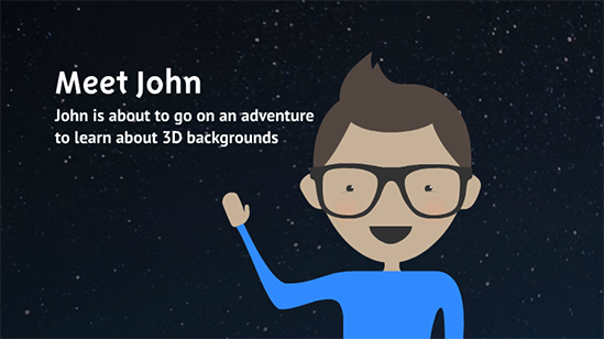
Instead of the typical “here is how to ____” approach, Meaghan created a protagonist named John, transforming the lesson into a narrative. Rather than scrubbing forward through a monologue, you click forward with interest, to see what happens to John next. And like the prezi itself, John contains a certain “meta-ness”, playing the part of student and explorer simultaneously.
The good and the bad
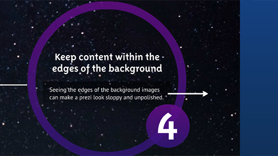
Not only do we get a demonstration of how to use 3D backgrounds effectively, but we are also taken right to the outer limits of the presentation itself – to the point where the illusion breaks down, and we get to see exactly how disruptive an unintentional peek behind the curtain can be. Meaghan could have faded out the edges of the background image, but instead she calls attention to imperfection in order to teach us a lesson.
Easter eggs
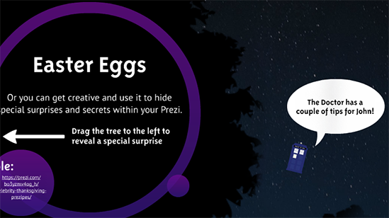
Current. Cheeky. Fun. The inclusion of the TARDIS from Dr Who, floating in space, is an “in” reference that is sure to bring a smile to people’s faces. Some people might not get the reference, and that is perfectly fine. The viral potential of this detail greatly outweighs the forgettable moment of head-scratching by the uninitiated. The circles and connecting lines at the end are even in the shape of the Cassiopeia constellation. This attention to detail adds a level of care and personality that reflects back on the company itself, and supports Prezi’s smart and playful brand.
Design quality
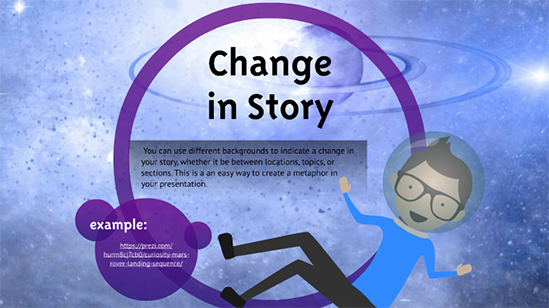
No matter how smart, all of this could still hurt the eyes if thought was not given to the color palette and design elements. John was illustrated in a unique and consistent style. The purple hues and contrast levels were chosen carefully, and look great even when the background colors change. The end result is a tutorial that borders on a promotional piece for the company, enjoyable even by viewers who didn’t have any lesson goals in mind.
Truly amazing work.


May i have the link to the background music or can some one email it to me. Thanks
[email protected]