
Several friends have asked why I’ve posted so little in the past 6 months. This entry of mine (featured on Prezi’s Design Blog) shares the details and thought process behind what I’ve been so busy with.
Designers and data-analysts often live in very different realms. The data folks live by numbers, making crucial decisions based on unit and measure. Conversely, designers rely on intuition based on their experiences working with people and their emotional responses. This contrast means that the two groups tend to work separately, doing what they do best, but rarely joining forces in truly collaborative ways.
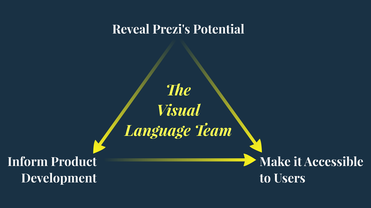
Well, at Prezi we welcome a challenge. Around six months ago, we created a task force composed of experienced presentation designers, data analysts, and UX researchers. This splinter group of experts, known as the Visual Language team, had one core objective: to improve the quality level of Prezi’s fonts, templates, and built-in assets, and to measurably improve the success rate of our users.
We kicked off the formation of this team with an intense weekend of strategy and brainstorming, at a secret bunker in Sacramento (a.k.a. my house). There were some basic questions we needed to ask ourselves before we could get rolling.
- “What is a template anyway?”
- “What makes a good template?”
- “What does success look like for presenters using a template?”
- “What does success look like for the people who design them?”
Let’s start at the top. A template is more than just a combination of theme-colors, fonts, and visual metaphors. A template is the first thing a person sees when they start a new prezi. And as we all know, first impressions go a long way. A template should be attractive enough to appeal to a wide range of people, but useful and versatile enough to keep them coming back for more.
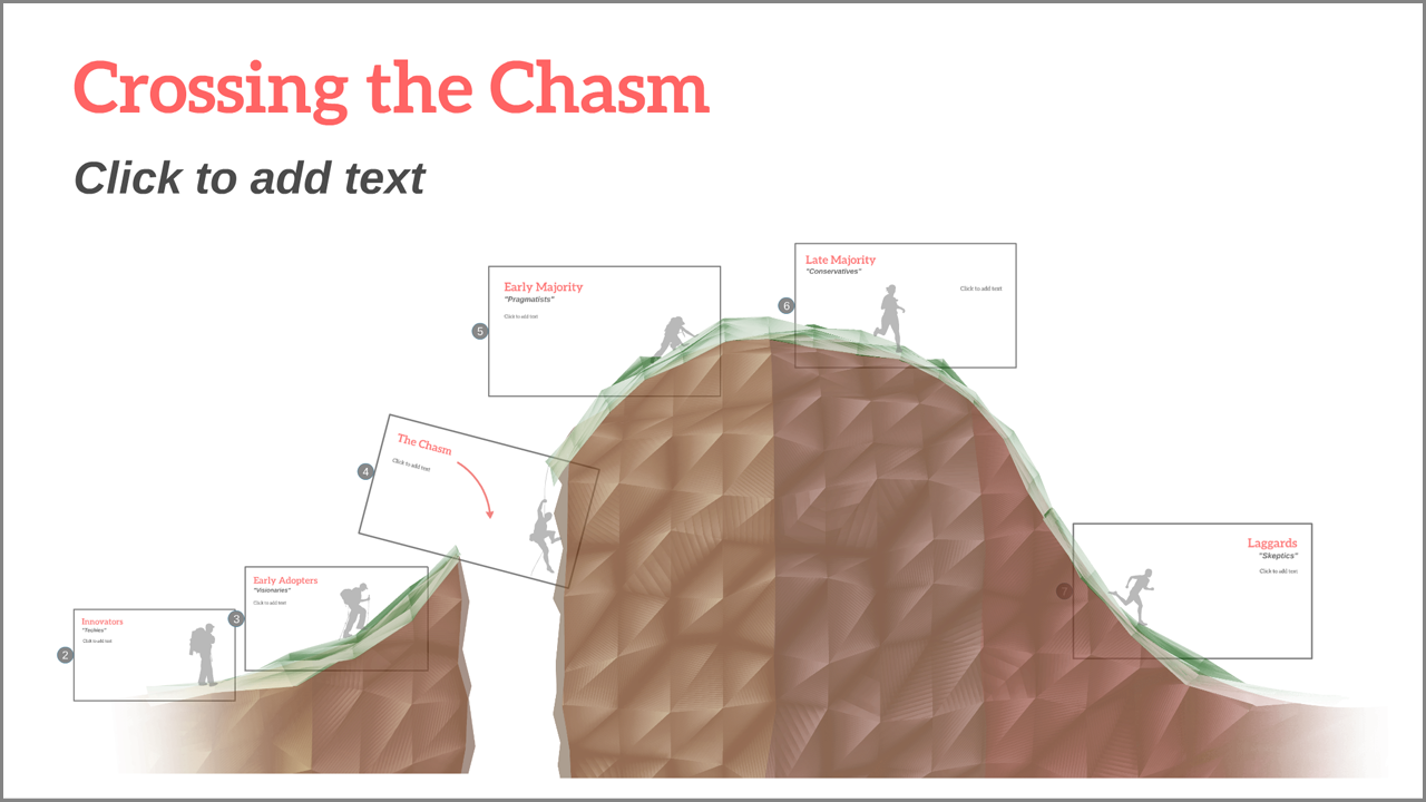 Crossing the Chasm is a great example of a
professionally relevant template with a playful twist
Taking a “fill in the blanks” approach is the wrong way to go when designing a good template. If a template feels like a boring form that you have to fill out, it can become stifling and bland. Instead, a good template should provide a balance of pre-designed material with the room to be creative. Think of templates like a Lego model. You don’t have to be a toy-builder to make a car out of them, but you can still walk away with a sense of pride at the fact that you put that car together. Similarly, a good Prezi template should come partially assembled, and provide intuitive guidelines that you can follow to easily create something you can be proud of sharing.
 The “fill in the blanks” approach can force users to delete or rearrange unused sections. A good template should not stand in the way of your creativity. The “fill in the blanks” approach can force users to delete or rearrange unused sections. A good template should not stand in the way of your creativity. |
 A good template should have a handful of pre-designed elements and layouts, clear guidelines on how to expand the structure, and plenty of room to grow. A good template should have a handful of pre-designed elements and layouts, clear guidelines on how to expand the structure, and plenty of room to grow. |
These are all great ideas, but without research and experimentation we wouldn’t be able to prove that these ideas truly help our users be successful. Enter the UX researchers. Working with people to see how they use each template, they set up test-groups where the designers could A/B test different iterations of their work. Before long, we were able to identify several important questions:
- Which design choices improve the odds that someone will select a template?
- Do certain design choices cause people to keep or delete template elements? (or worse, abandon the presentation altogether)
- Is the template versatile enough to allow you to tell your whole story?
- Does it leave enough room for a person to add content without moving other things?
- Are they learning to use zoom in a meaningful way?
- And finally, are they proud enough of their creation to press ‘Present’, and show the entire prezi from beginning to end?
We met every morning to review the results from the previous day, and to discuss what was working and what wasn’t. We formed hypotheses and tested them, and we identified several principles that reliably increase a template’s performance. But we also learned that rules are made to be broken, and that sometimes exceptional design can create exceptions to rules. The road to victory, it seems, is accessible through a harmonious balance of measurement and instinct. The worlds of data and design apparently do more than just overlap. They combine to become something even greater.
 Little details encourage users to zoom and explore, teaching them how to navigate in z-space, and inspiring them to create things at different levels of zoom. Little details encourage users to zoom and explore, teaching them how to navigate in z-space, and inspiring them to create things at different levels of zoom. |
 Uncluttered backgrounds and varied frame sizes promote a feeling of open space. People get more creative when they have room to breathe. Uncluttered backgrounds and varied frame sizes promote a feeling of open space. People get more creative when they have room to breathe. |
 Figurative backgrounds should be versatile enough to tell many stories. The gauge shown here shows motion and performance without specifically referring to one particular metric or meaning. Figurative backgrounds should be versatile enough to tell many stories. The gauge shown here shows motion and performance without specifically referring to one particular metric or meaning. |
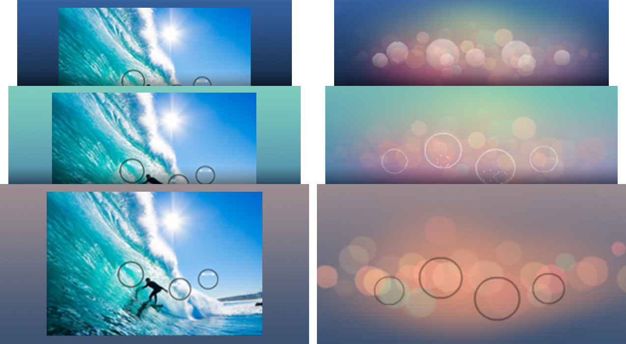 In the old days (left), photographic backgrounds did not change if you customized your theme colors. Today (right), “reactive backgrounds” look good no matter which background colors you choose. In the old days (left), photographic backgrounds did not change if you customized your theme colors. Today (right), “reactive backgrounds” look good no matter which background colors you choose. |
Most satisfyingly, our learnings and expertise have resulted in a new collaboration. The UI designers and the developers at Prezi have begun to ask us for input on what new features would enable us to produce higher quality design, and enable people to create professional and impactful presentations. You can’t design a perfect tool if you’re not clear on the intended use, so together we collaborate on vision-pieces and proposals, some of which have already been implemented.
|
|
|

And It’s here that I find I enjoy my job the most. I came to Prezi with the dream of being able to lend my design expertise to help grow a cutting edge presentation software company, still in it’s formative years. And I’m happy to report that all of us on the Visual Language Team feel successful in this feat. Having combined traditional design processes, agile review cycles, and constant scientific feedback makes us feel effective, valuable, and appreciated. We’re navigating uncharted waters, creating design rules and principles for a whole new creative medium. It’s really exciting stuff.
And that means that morale on our team is quite unlike anything I’ve experienced before. Between California and Budapest, we work across nine time zones with surprising efficiency and enthusiasm. When it’s 5pm there, it’s 8am here. We meet, review, laugh, vent, and then pass the baton. We have strong leadership and compassionate peers. We burn the midnight oil when necessary, but we still manage to maintain a healthy work-life balance. At this point in time, there is no place I’d rather be.


Recent Comments